Skip to content
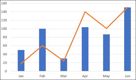
Art of the (IM)Possible
Six months into my OneStream career a client made a “simple” request. We want a chart that looks like this:


I had built graphs before, easy – right? So, I set up a Cube View, connected it to a chart, and began to click through every setting possible in the Advanced Chart Component to see how to overlay a line and a bar. I’ll save you some time checking, there is no combination of settings that gets you here. Next, I thought of the BI Viewer but with every good requirement there is an equal but opposite requirement that the client forgot to mention the first time around. They wanted to be able to export these into a Book. BI Viewer was now out as exporting to a Book is not a current function of it, back to square one.
From here I searched through the Design and Reference Guides, far and wide on Google, and bothered some colleagues. I was just about to give up and determine this impossible when somewhere deep in a OneStream document I found a screenshot that looked just like my graph above! It must be possible!
This was the moment in my OneStream journey I learned never ask “IF” OneStream can do it, but “HOW” (and so I don’t get in trouble here I’ll also mention at times you should probably also ask “SHOULD” OneStream do it). Around this time, I reached out to my colleague across the pond (shout out Daniel Hopson, without you this blog would not exist) who said “Oh yeah I have some code that I used to do something similar”.
But wait….

…. No one ever mentioned I could use code to alter my dashboard components. New dashboarding level unlocked.
Just like anything else in OneStream with the right knowledge things become easy (sort of). So, if you ever find yourself in a situation where you need to graph something that the base settings won’t allow, here is what you need to know.
Step 1: Create a Cube View for each data set. My example is pretty simple.
For my bars I want the three accounts that make up the Cash Conversion Cycle in the rows and twelve months in the columns.

For my lines the total for Cash Conversion Cycle Actual and Budget and the time.

Step 2: Create a data adapter for each Cube View. To stay organized I like to prefix my dashboard Components with letters representing the dashboard object, then the dashboard name, and a description. (DA = data adapter, CCC = Cash Conversion Cycle Dashboard, Graph_Bar = a note about what this object is). When you build large dashboards with possibly hundreds of components a good naming convention is important. Do what makes sense to you.


Step 3: Create your Business Rule
You will need to create a Dashboard Data Extender Rule.
The below rule will be what you need to combine these axes together.
A couple call outs:
- Here is where you define your series, you can add as many additional items as you need by defining additional Dimensions.
- Reference your Data Adapter by name as well as the Chart Type you are assigning to it. Do this for each item in your series.
- Format each item in your series.
- If you need additional items add before the ‘Add Single Line Data’ comment.


Step 4: Create a dashboard data adapter for your Business Rule. Change the Command Type to Method and Method Type to Business Rule. The Method Query Syntax is {Business Rule Name}{Dataset Name}{Parameter} In this example there is no parameter so we will leave the third set empty, but you must include them.

Step 5: Create an advanced chart component. Change the Chart Data Series Source Type to reference a BR and attach all your data adapters to the component. Note, the Chart Data section is all the way at the bottom of your options.


Step 6: This is where the magic happens, attach your advanced chart to a dashboard to preview:

Step 7: Get as creative with parameters, Combo Boxes, color schemes, etc. as your imagination (or client) allows.
I have also used this to overlay two sets of years on the X-axis of a graph. When you add 24 months in a Cube View, it will display as 24 data points. This allows you to display two years over each other like so:

A third example shows YTD CapEx trending towards budget. (If you can’t tell, I really like this rule).

Good luck with your dashboarding!