Exactly a year ago I decided to write my first how to blog! Time flies when you’re having fun (or fighting with learning OneStream)! That post was on using a Dashboard Data Extender Rule with a advanced chart component to allow you to plot multiple data sources or line types on the same chart.
The Elusive Secondary Axis
If you have done Dashboarding in OneStream you are very aware of the many settings you get on each component. Something I had always seen as an option on the advanced chart component was the Chart Secondary Y-Axis section. I had toggled this setting on before only to find to my dismay, but not necessarily surprise, that nothing happened. Yet another mystery chart setting in OneStream I thought.
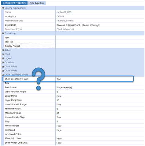
This was a mystery I decided to let lie unsolved until I got a request to build a graph showing Revenue and Gross Profit along with Gross Margin Percentage, similar to the one below.
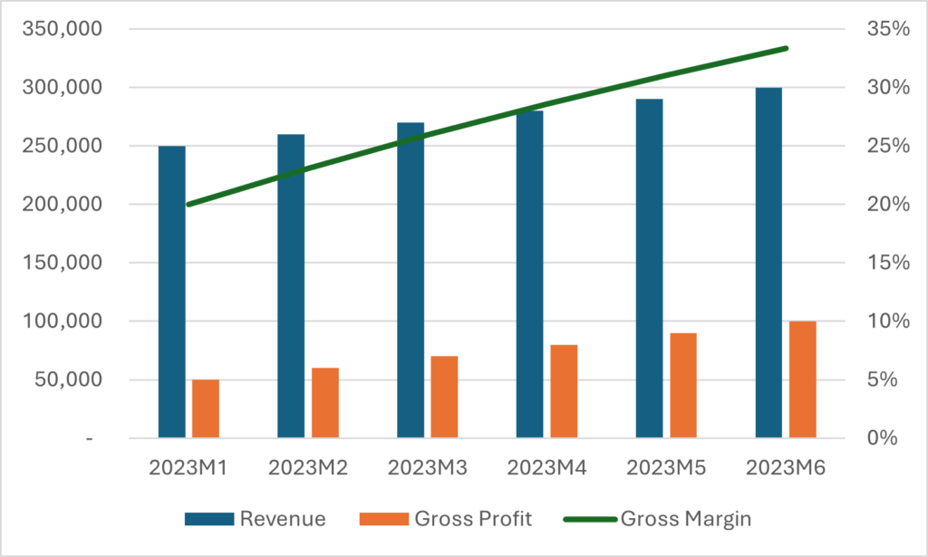
This seemed like a basic achievement, after all Excel could do it.
Getting A Game Plan
Back to the drawing board it was, I could go toggle the setting to show the secondary y-axis on and off a few more times in hopes that the results would be different, but someone much smarter than me once attributed that to insanity.

So, I did what any good consultant would do next, I Asked Chat GPT. I waited for my generated response and got something back that was less than helpful.

After that I moved on to the next best thing in the play book. I opened up the OneStream Design and Reference guide and used Control + F to search for the word “secondary”. In case you were wondering this appears one time in the 1,346 pages of the guide and was also not helpful. Arguably even less helpful then my first attempt, but now we all know the definition of a secondary axis:

When I widened my search I came across the section of the Design and Reference guide that refers to using a Business Rule as a data source for a chart and here is where I had my lightbulb moment. What if the answer I needed was actually in the Business Rule I so lovingly described in that first blog this whole time?
Back to the Beginning
I dug up the example code I used to share with all of you a year ago and decided to see what else I could control. Sure enough when I looked at the Intellisense options I found just what I needed, it looked like I could use this to format my series to show on a seconday axis.
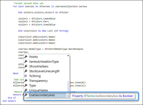
Could it truly be that simple? Just one line of extra code?
Moment of Truth
I went to my dashboard and refreshed and once again there was NO change. Disappointment, defeat, insanity? Wait a minute, I realized I had the show secondary axis setting on my chart set to False still. I made this update and refreshed and low and behold there it was!
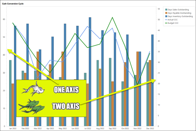
Now I had my second axis! Albeit on a graph that has no business having a second axis. But now I could take what I learned and put it somewhere that matters. And now you guys can reference the code from that first blog (linked above) as starting point. The only addition made to the original code was adding line 66 below:
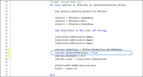
All we have to do is tell it to use the secondary axis on the data series you want to turn it on for and then turn the show secondary axis setting to True on your advanced chart component.
The Real Life Application
Our friends at Callahan Auto Parts wanted to be able to quickly view Gross Profit and Revenue with their Gross Profit percentage on one dashboard screen.
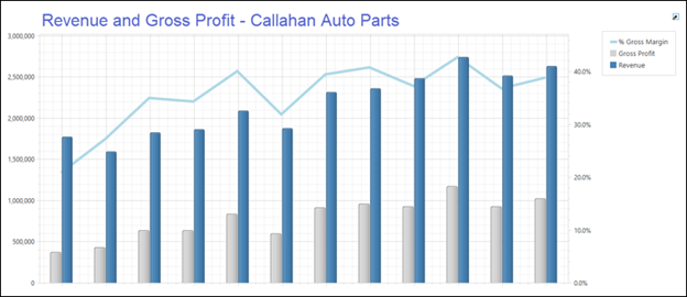
Case Closed
There you have it, another OneStream mystery solved. There are several settings you can control with your chart using a business rule, I encourage you to play around with them, you never know what you might find!
