

When it comes to reporting, OneStream offers different possibilities. While the cube is ideal for planning and analyzing financial data, users often need additional detail that sits behind those numbers. Product master data is a good example: revenue may be planned at the product-line level, but the supporting master data can contain thousands of SKUs across different sizes, colours, and model years. That level of operational detail is better maintained in a relational table than added to the cube as individual dimension members.
A SQL Data Adapter can bring that detail into OneStream, while BI Viewer turns it into a clean and interactive reporting experience. In this example, we will use both to explore product revenue, margin performance and SKU-level detail through charts, conditional formatting and interactive filtering.
Let’s walk through the process!
What Makes BI Viewer Worth Using
If you have only ever built Cube Views, BI Viewer feels like a different tool, because it is. Instead of rows, columns and member filters, you get a drag-and-drop canvas with grids, charts, pies, treemaps, scatter charts and cards.
Starting With the Data
My relational table is already populated, so all the adapter has to do is select the columns I want to pull. Application > Dashboards > Components > Data Adapters, create one, set Command Type to SqlQuery, and write the SELECT statement that returns the columns you need.

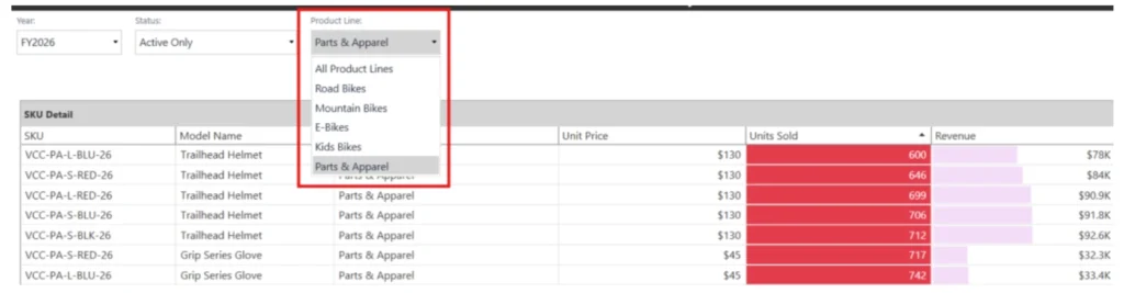
Filtering can also be handled at the source. Create a Parameter, reference it as a token in the WHERE clause of the data adapter and bind a combo box to that parameter. When a user makes a selection from a dropdown, the query re-runs and the report reflects the filtered results.

Setting Up the BI Viewer
Create a new Component and set the type to BI Viewer, attach your adapter on the Data Adapters tab first. You can attach more than one, and each becomes its own data source.
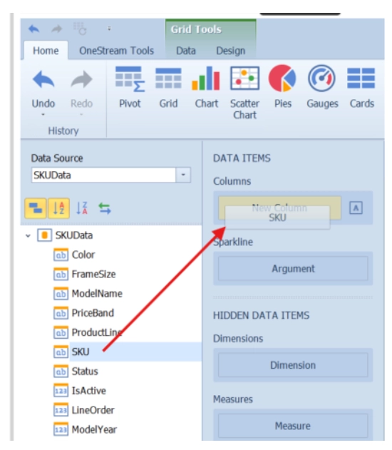
The field list on the left is just the columns your adapter returned. The DATA ITEMS panel in the middle changes depending on which item is selected, and you build a visual by dragging fields into the right pane.
- Columns is the grid’s single list, holding both dimensions and measures in the order you want them displayed.
- Arguments are the categories a chart is plotted across.
- Values are the measures being plotted.
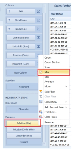
- Hidden Data Items are included in the visual but never displayed and can hold both dimensions and measures.
Building the Grid
I started with a Grid, the fastest way to confirm the data is coming through. Drag the fields you want into the Columns list and you have a working table in about thirty seconds!
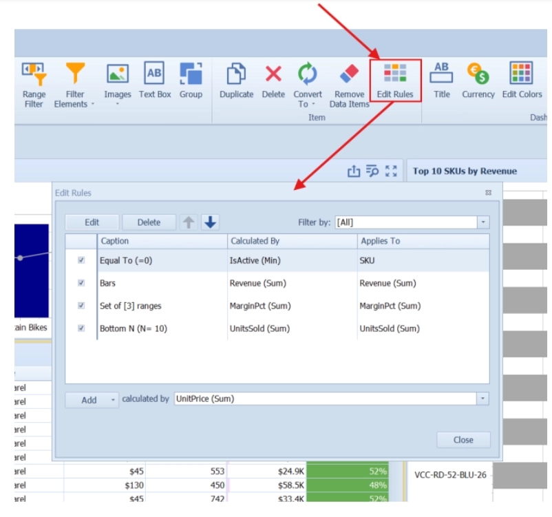
Then it looked like a data dump… which is where formatting comes in. Under Edit Rules you can stack as many rules as you like, each working differently:
- A Value rule applies grey italic formatting to discontinued SKUs on the SKU Column, making them easy to distinguish from active products.
- A Bottom N rule on Units Sold Column highlights the slowest movers in red
- A Bar rule on Revenue Column draws a bar inside each cell, so you can see the distribution without having to actually read the number
- An Icon Range rule on Margin Pct Column highlights low, medium and high margin products using red, orange and green indicators, making performance easier to compare at a glance.
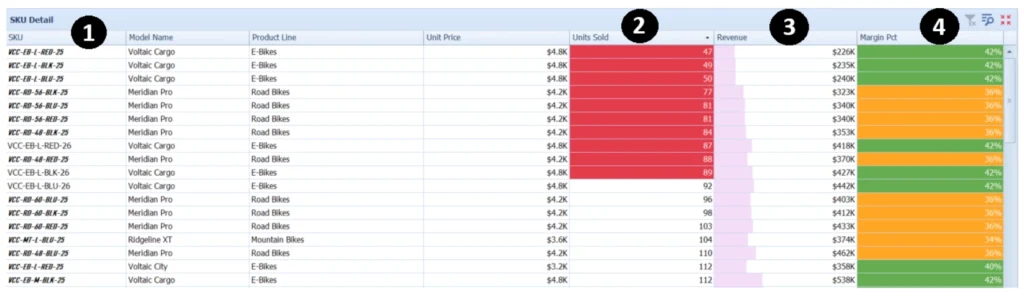
The key point is that a field does not need to be visible in the grid to control its behaviour. For Example, IsActive field is added as a Hidden Data Item, summarized using Min, and used to apply formatting to discontinued SKUs on the SKU Column. This keeps the status column out of the report while still allowing it to control how each row appears.
Adding the Charts
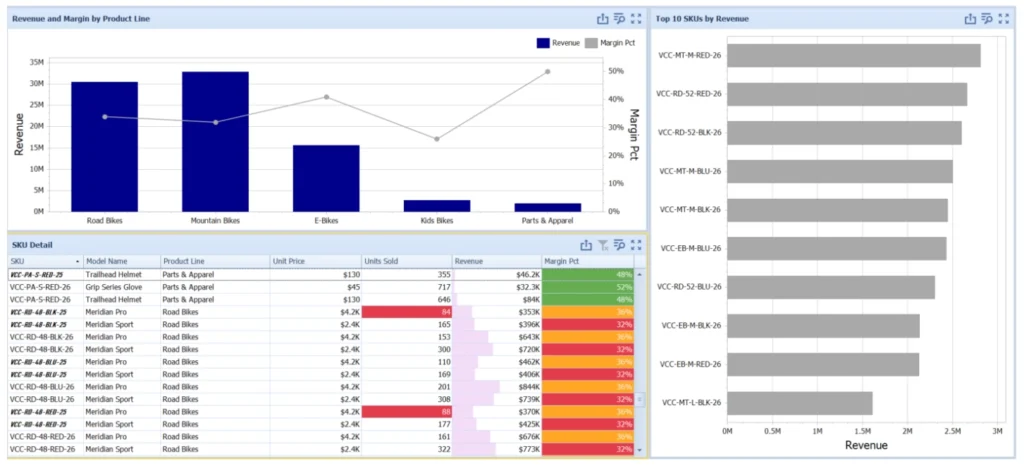
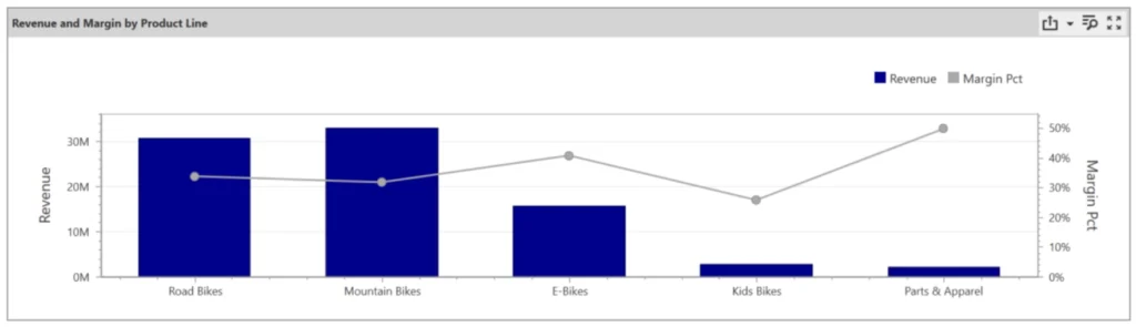
My main chart shows Revenue by Product Line as bars, with Margin % as a line on a second axis. It makes a point the numbers alone do not: Mountain Bikes has the biggest bar and one of the lowest margin lines, while Parts and Apparel is the smallest bar and the highest margin by a mile.
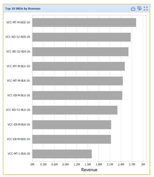
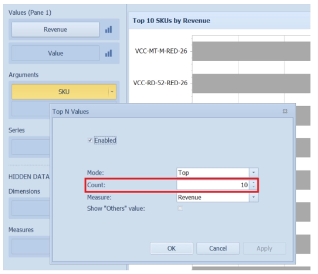
Another useful visualization is a Top 10 SKUs chart. SKU field goes into Arguments and Revenue field into Values, then select the SKU field and apply a Top N filter of 10. Top N keeps the chart focused on the highest-ranking members.
Final Thoughts
That is a complete BI Viewer report, from a SQL Data Adapter to a formatted, interactive report. The SQL brings in the columns, and BI Viewer handles the presentation, formatting and interactivity.
If there’s one concept worth remembering, it’s Hidden Data Items. A field can be included in a visual without ever being displayed, yet still drive sorting, filtering, calculating, and other interactive behavior behind the scenes.
Understanding how SQL and BI Viewer work together gives you the flexibility to build reports that are both powerful and intuitive.
Reach out to Black Diamond Advisory to schedule a demo and explore BI Viewer in more detail.